
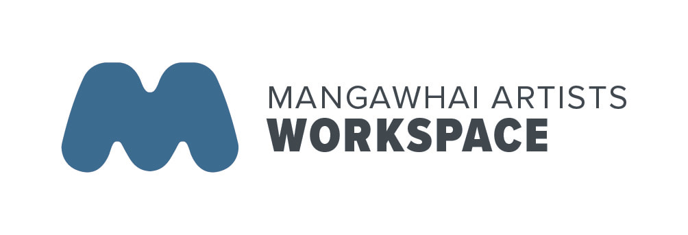
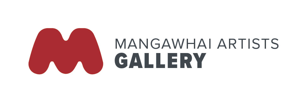
Contemporary look for Mangawhai Artists
Our logo is critical to successful promotion of the Mangawhai Artists brand to locals and visitors. Over recent months the Committee has been responding to suggestions that the logo could be refreshed. It has served us well, and moving to the future a refresh is appropriate.
We are pleased to introduce a contemporary, versatile and memorable logo. It is strong and iconic, and never dominating the artwork. It is inspired by the local physical environment and community, and the quality of Mangawhai Artists’ artwork is integral to the brand. It is a simple shape which can stand with type, or alone without type and can be reduced to small sizes or enlarged for major signage. People don’t need to read anything literal into the logo – we want people to find it memorable and recognise it.
It is designed to be warm, inclusive, varied, changing, progressive, friendly and inviting. We have taken professional design advice (Katherine Habershon) to achieve this new logo which has a strong personality, will endure for many years and communicate with clarity in a visually cluttered world. It looks great in a line-up of logos! Exhibiting and tutoring artists will be pleased with the templates for promotion of exhibitions and workshops.
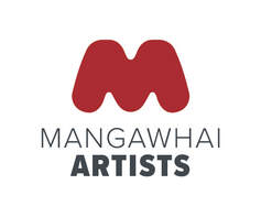
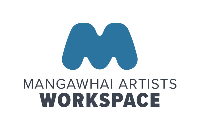
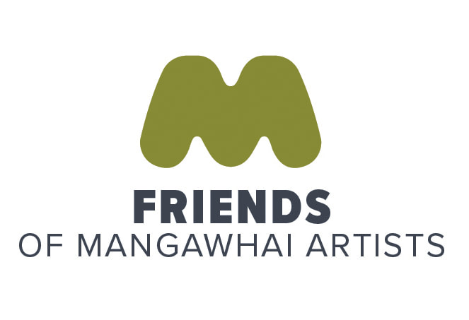
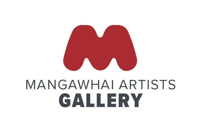
Red will signify the Gallery and Mangawhai Artists, green for Friends of Mangawhai Artists and blue for the Artists’ Workspace and learning opportunities.
Our logo is critical to successful promotion of the Mangawhai Artists brand to locals and visitors. Over recent months the Committee has been responding to suggestions that the logo could be refreshed. It has served us well, and moving to the future a refresh is appropriate.
We are pleased to introduce a contemporary, versatile and memorable logo. It is strong and iconic, and never dominating the artwork. It is inspired by the local physical environment and community, and the quality of Mangawhai Artists’ artwork is integral to the brand. It is a simple shape which can stand with type, or alone without type and can be reduced to small sizes or enlarged for major signage. People don’t need to read anything literal into the logo – we want people to find it memorable and recognise it.
It is designed to be warm, inclusive, varied, changing, progressive, friendly and inviting. We have taken professional design advice (Katherine Habershon) to achieve this new logo which has a strong personality, will endure for many years and communicate with clarity in a visually cluttered world. It looks great in a line-up of logos! Exhibiting and tutoring artists will be pleased with the templates for promotion of exhibitions and workshops.
Red will signify the Gallery and Mangawhai Artists, green for Friends of Mangawhai Artists and blue for the Artists’ Workspace and learning opportunities.
|
See some examples of invitations below, and also click on this downloadable PDF file for a full display of ways we can use the logo . |
| ||||
|
|
|
|

|
|
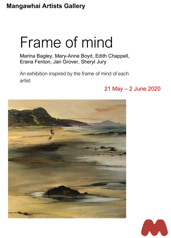
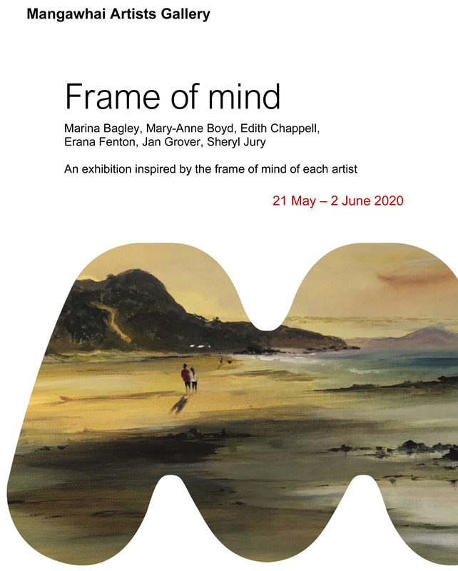
Examples of how the logo can be used
these are mock-ups only, not actual exhibitions
|
|
|
|
|
|
|
|